For reference, here is a sunset chart example that you can use to improve regulatory or risk project reporting. I have named these ‘sunset charts’ because the color scheme causes them to look like the evening sky (with green instead of deep blue at the top) as when the sun is setting. Sunset charts are used in addition to your normal four box report for risk or regulatory programs. They are used to enable better communication to senior stakeholders where there are critical questions for risk or regulatory projects such as:
- Have we made any substantial progress (at reducing the risk)?
- When will we get to an acceptable level of risk?
- How do we compare against industry or our peers? In terms of current capability? Or acceptable level of risk?
- What is our target capability level? How does that compare against others?
- What are the key milestones that will demonstrate or enable progress?
It is also worth noting that this format can be used to summarize for senior management, board committees or even regulators. The chart clearly conveys how you will progress and achieve a target state and where that target state is versus acceptable level of risk. The sunset chart can be supported by additional details as needed of course. Please note that the sunset chart is far better than the typical laundry lists of issues or lengthy reports that try to explain current and future state, often at such a detailed and technical level, that typically results in few senior stakeholders fully understanding or are left wondering if the project team can actually make progress and achieve the goals.
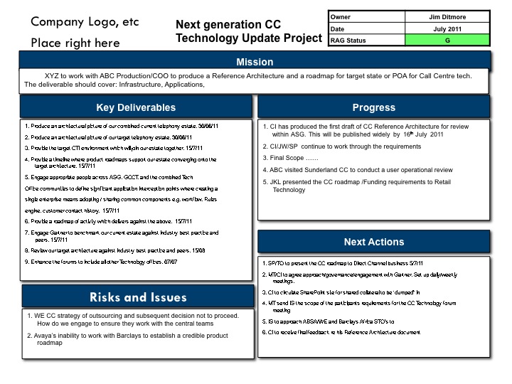
Sunset Chart Example
Below is the example of the Sunset Chart.
As you can see in the example, the normal axis are time on the X axis and Industry Performance by Quartile or other Capability measures (e.g., Capability Maturity). In this example, we actually are showing the progress of two capabilities (Availability and Resilience & Recoverability) of an organization against industry performance. There is a similar target level for both (here 1st Quartile performance (e.g., your capability performance places you in the top quartile of all companies in your industry or market sector). Further, both historical progress, current status and future progress are tracked. In addition, key milestones, either accomplished or to be accomplished are noted on the the trajectories. The color of where your capability currently is, should match the risk color as evaluated. Note that acceptable level of risk is also shown, and importantly, it includes the reference to the industry performance metric (e.g., here, industry quartile).
Credit for this version of the Sunset Chart report goes to the Danske Bank IT Operations and IT Security teams.
And here is the downloadable version in Powerpoint: Sunset Chart.
Please let me know if you have any recommendations or additions to this Sunset chart example.
Best, Jim Ditmore